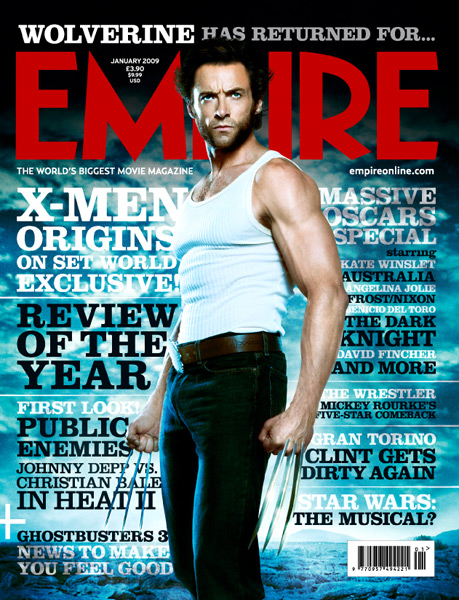
Sunday 13 November 2011

Magazine Cover Analysis; Spiderman


Purpose
The main selling point of this magazine is 'Spiderman', so the main image is of the protaganist, with the largest copy (bar the title) introducing the title story. It also advertises free posters for fans of 'Rocky 6' and 'Eragon' and a '20 page fantasy special', to appeal to a wider audience.
Colours
The main colours used are red, black and white. This seems to be a reccuring theme in movie magazines and they all seem to follow the same conventions.
Image
There is one main image featured of the protaganist of the feature story, and takes the form of a mid shot in the centre of the page. There are also two small images on the left hand of the bottom third, advertising the free posters inside.
Copy
Underneath the magazine title is the slogan 'The world's best movie magazine' and on the right hand side the website address. The issue number and date are featured at the top of the page, within the 'M' of the title. The copy advertises the main feature, the free posters and 5 other sub stories. Some of the copy requires the reader to have previous knowledge, such as 'Thunderdome kicks off' as many people may be unaware of who 'Thunderdome' is.

Saturday 12 November 2011

Magazine Cover Analysis; Inception


Purpose
The main story and cover image of this magazine is the film 'Inception'. It is also described as the 'mind-blowing issue' which may be related to the 'Inception' feature, or may be due to it being a special edition or including special content. It would appear to immediately appeal to action/thriller fans, however also includes content for younger fans (toy story).
Colours
The main colours used are red, white, grey and black. The title is mainly grey with hints of blue, and is comprised of computer/technological components. This transfers slightly to the background which is of a blue hue.
Image
The cover features one main image, central on the page and is a mid-long shot of the protaganist of the featured film. There is also a puff featured on this front cover drawing your attention to another main feature of the magazine.
Copy
Underneath the magazine title is the date and issue number on the left hand side, and the magazines website address on the right. As the cover can't use too many words, the words used must excite and draw the reader in. Lexis such as 'mind-blowing' 'first look' and questions like 'Re-boot of the year?' grab the readers attention and encourage them to buy/read the magazine.

Magazine Cover Analysis; X Men


As I found it difficult to find any film magazine front covers featuring horror films, I have chosen some of the action genre that I can analyse.

Purpose
This front cover is mainly targetting fans of the X-Men films by using a large image of Wolverine, and large copy refering directly to the film. The magazine also describes itself as "the world's biggest movie magazine", so targets all movie fans due to its broad nature.
Colours
The 'Empire' title is bright red and the most colourful part of the cover. The other main colours are black, white and grey. The background of this cover features a very blue landscape, over which the image stands out.
Image
The only image on the cover is a mid-long shot of the protagonist in a very powerful and dominant pose. The image correlates with the main story, which is how my front cover will work.
Copy
The skyline of this magazine features text relating to the main story, and beneath it sits the magazine title, which never moves. Within the triangle of the 'M' in the title sits the magazine's price and date. Underneath the title is the slogan/tag line "the world's biggest movie magazine" and also the magazine website. The stories featured on the front page sit around the image following the images lines and curves. The copy includes very little words, with exciting wording to make the stories look interesting: 'massive' 'review of the year' and even an interogative to intrigue the reader 'star wars the movie?'.

Film Magazine Covers

Friday 11 November 2011

Film Poster Analysis; When A Stranger Calls


Title
When a Stranger Calls is quite an eerie title; the word 'stranger' has connotations of danger and the unknown, and the way in which the title is syntactically structured 'When A Stranger Calls' gives the illusion of something frightening happening after a certain event that is usually innocent.

Title Graphics
The title is in a bold blood-red colour, which stands out vibrantly over the black background. It sits centrally in the bottom third of the page. The font is a fairly plain serif font, but has an eerie sort of blurred effect that adds to the genre of the film.

Tag Line
This poster does not have a tag line, but one thing I would comment on is the website address: 'haveyoucheckedthechildren.com'. This is very creepy and unusual compared to normal horror film websites which makes it stand out.

Images
The image in this poster is similar to the other two in size and positioning, with the image taking up most of the page in terms of height and is also framed centrally. The image is of a presumabley male arm draping down holding a mobile phone in his hand. On the mobile phones screen is an image of a screaming girl. This reinforces the idea of something scary happening involving the seemingly innocent mobile phone.

Colours
The colours mainly used in this poster are black, red and white, which complies with the conventions of horror. However the eye is drawn to the girl on the phone screen, wearing a pink shirt. The pink of the girls shirt could imply innocence and love, which contrasts with the deep black and red.